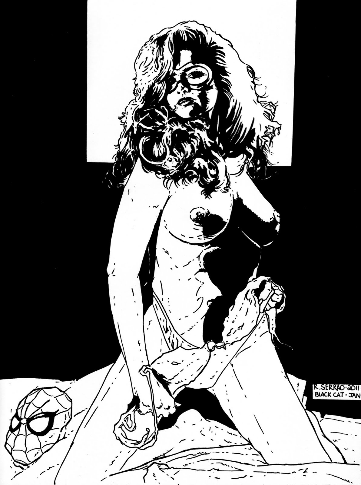
Hi and welcome back. Todays Blog is a step by step process of how I colored an Image I drew and maybe give you a bit of insight and hopefully you might learn something new. When I originally decided to do a pin up of an established female character like the Black Cat I not only wanted to make her sexy but I also wanted to have a bit of fun at the same time. It took a lot for me to add colour to my black and white original image. When you start colouring your original there is always the chance that you might make a mistake and ruin it, so you have to be very careful how you approach the colouring process. I had decided to keep the colouring scheme very simple, mixing watercolurs, markers and coloured pencils. Some of the other tools I later used were a bit of an accident and that i'll get into a bit later on in the Blog. Watercolours came first. This was the base for the whole picture. I used the watercolurs dry and avoided getting my paper wet before I put the colours down on the art page. Some people like to colour their work when the page is wet first and that's just fine for them but I have a need for controling just how my work is coloured. If you get your page wet first there is always the chnace that the colours run and smear in a way that you didn't intend. So if you're a control freak like me then dry is definitely the way to go. I used the smallest tip brush I had. Why? Because this way I could really spread the paint and the lines of demarcation for each time my brush dried was minimal. Another little trick that i discovered helped give the artwork a seemless appearance. Because of the black background this made things a bit easier colour wise and also a lot faster. Once the watercolours had dried I could then go in with coloured pencils for some accents on the image. Initially the web in the background was done with a white coloured pencil but while it was subtle it didn't have the punch I was looking for, so I decide to try something a bit more drastic. I had just gotten some opaque white acid free pens and was itching to try them out. I ended up getting a bit too carried away when I was doing the web

. Still I needed to add another layer to the picture as I still felt something was missing. I started splattering grey ink on the page, followed by white ink. Then finally adding in some white highlights in the Cat's hair and around her body to make her stand out a bit more against the web background. Her lips were the last thing I played around with. After some of the white lines had dried I went back in again and added even more accents. Some of the shadows I had done were a bit too dark and needed to be lightened and this way of doing it was more work than I would have liked but once again I could control every step of how much detail went into the final image. A lot of what ended up on the final page wasn't even planned and I just got carried away. In the end it turned out better than I even imagined. On the technical aspects of this Blog. I used 2 different size of brushes and neither of then were expensive. In fact all of the tools used to create this image were anything but expensive. The brushes were bought in bulk and came up to mere cents for each unit. The white opaque pen was about 3.00 US for a pack of 2 pens. My technical pens are made by Sakura and are disposable and a pack of 3 different sized nibs reatails for about 10.00 Canadian and last about 5-9 months and that depends on how rough you are and how often they are used as well. They are acid free and waterproof. Those 2 details are very important. Acid free means that the lines you put down on paper won't yellow with time like a sharpie would. Waterproof is also very important and when using watecolours it stops the lines from smearing. These pens dry very fast and are easy to manipulate when drawing. How much pressure you put down on the nibs are also another important issue that needs to be addressed. You almost have to look at the pens as incredibly fragile and vary exactly how much pressure you put down on them. This makes them last longer and it can also give your lines are lot more vary widths,especially when you are either cross hatching or doing some kind of feathering effects in your artwork. I tried dragging my brushes across the page keeping part of my hand on the page at all times. This helped me not over emphasize any areas that I was colouring. This comes back down to how much pressure is put down on the paper and exactly how the paint applies to the artwork. I tried to be as subtle as possible. Working on a woman subject is difficult because if you put too much detail in the face you can age the subject and that can also ruin the effect of beauty and allure that you're trying to achieve. Now that doesn't mean that older women aren't beautiful but close attention has to be payed to the age of the subject/character that is being painted or drawn. To do the splattering effect on the artwork I used an old toothbrush, white and black ink. This was incredibly easy to do the grey and white splatters by mixing the 2 inks together in equal parts and then dipping the toothbrush into it and then splattering it onto the artwork. Now this is a very tricky thing that you're doing so if you want to control the way the ink splatters and where it splatters, you have to give it direction and at the same time protect the image you just drawn. It was a simple task. I just took some copier paper and cut a hole in it a bit smaller than that of a tennis ball. This way I could do sections of the artwork and then redo them if nescessary. All the while keeping a close eye on how much white and grey ink went onto the page. The splatter effect also requires a bit of practice but it is quite an easy technique to master. The brush acid free markers I used for tiny details are also made by Sakura and the colours are very nice and bright and are perfect for tiny highlights. Copic markers are awesome but very,very expensive. The pack I initially bought only cost me 5.00 US and I expanded the amount I had by adding different types to my collection. The type of coloured pencils I used were made by Prismacolour and I've had these pencils for the better part of 18 years and they are surprisingly long lasting and very durable. Originally when I bought these pencils I had paid only 50% of the regular price and I got a complete set of over 144 colours. To this day I still have them. They were a great buy. I hope this Blog has given you ideas of techniques that you might like to try for your own work as well as some tools that you can play with for your upcoming works of artwork. Rich.


 . Still I needed to add another layer to the picture as I still felt something was missing. I started splattering grey ink on the page, followed by white ink. Then finally adding in some white highlights in the Cat's hair and around her body to make her stand out a bit more against the web background. Her lips were the last thing I played around with. After some of the white lines had dried I went back in again and added even more accents. Some of the shadows I had done were a bit too dark and needed to be lightened and this way of doing it was more work than I would have liked but once again I could control every step of how much detail went into the final image. A lot of what ended up on the final page wasn't even planned and I just got carried away. In the end it turned out better than I even imagined. On the technical aspects of this Blog. I used 2 different size of brushes and neither of then were expensive. In fact all of the tools used to create this image were anything but expensive. The brushes were bought in bulk and came up to mere cents for each unit. The white opaque pen was about 3.00 US for a pack of 2 pens. My technical pens are made by Sakura and are disposable and a pack of 3 different sized nibs reatails for about 10.00 Canadian and last about 5-9 months and that depends on how rough you are and how often they are used as well. They are acid free and waterproof. Those 2 details are very important. Acid free means that the lines you put down on paper won't yellow with time like a sharpie would. Waterproof is also very important and when using watecolours it stops the lines from smearing. These pens dry very fast and are easy to manipulate when drawing. How much pressure you put down on the nibs are also another important issue that needs to be addressed. You almost have to look at the pens as incredibly fragile and vary exactly how much pressure you put down on them. This makes them last longer and it can also give your lines are lot more vary widths,especially when you are either cross hatching or doing some kind of feathering effects in your artwork. I tried dragging my brushes across the page keeping part of my hand on the page at all times. This helped me not over emphasize any areas that I was colouring. This comes back down to how much pressure is put down on the paper and exactly how the paint applies to the artwork. I tried to be as subtle as possible. Working on a woman subject is difficult because if you put too much detail in the face you can age the subject and that can also ruin the effect of beauty and allure that you're trying to achieve. Now that doesn't mean that older women aren't beautiful but close attention has to be payed to the age of the subject/character that is being painted or drawn. To do the splattering effect on the artwork I used an old toothbrush, white and black ink. This was incredibly easy to do the grey and white splatters by mixing the 2 inks together in equal parts and then dipping the toothbrush into it and then splattering it onto the artwork. Now this is a very tricky thing that you're doing so if you want to control the way the ink splatters and where it splatters, you have to give it direction and at the same time protect the image you just drawn. It was a simple task. I just took some copier paper and cut a hole in it a bit smaller than that of a tennis ball. This way I could do sections of the artwork and then redo them if nescessary. All the while keeping a close eye on how much white and grey ink went onto the page. The splatter effect also requires a bit of practice but it is quite an easy technique to master. The brush acid free markers I used for tiny details are also made by Sakura and the colours are very nice and bright and are perfect for tiny highlights. Copic markers are awesome but very,very expensive. The pack I initially bought only cost me 5.00 US and I expanded the amount I had by adding different types to my collection. The type of coloured pencils I used were made by Prismacolour and I've had these pencils for the better part of 18 years and they are surprisingly long lasting and very durable. Originally when I bought these pencils I had paid only 50% of the regular price and I got a complete set of over 144 colours. To this day I still have them. They were a great buy. I hope this Blog has given you ideas of techniques that you might like to try for your own work as well as some tools that you can play with for your upcoming works of artwork. Rich.