You'll notice that for a little while now I was very quiet here on blogspot.com, facebook and various other platforms. Well I won't bore anyone with all of the stuff that was and still is bouncing around in my head but what I will talk about is what got the cobwebs and dust bunnies jumping around.
Okay, hold on to your undies people.
Back in September, I was appearing at the Comic Con in Montreal and there were so many things happening at the same time, almost too many things. This is something that I've learned to live with. When you're an independant artist that promotes your own work, things can get really hectic very quickly. There was also a major decision I had to make a few weeks before the Con and while I was incredibly stressed out and things really didn't go my way on the first pass. So, instead of getting all upset and blaming what was going on on other people I had decided to find a way out of the box I was now placed in. I found a solution quickly and not only did the solution prove to be a good idea, it also helped me get my name out to some people that have never heard it or seen my work before. This showed me that by my finding a solution to the problem that had presented itself, everything ended up working out on a positive note. I had refused to admit defeat and found a way to get what I wanted, on the date I needed it for and I also ended up with a few more contacts that I would never had met if my bad luck hadn't befalled me. The point of all of this by now if you haven't gotten it yet is this:
When things don't go your way, don't look for a scapegoat, find a solution and get the job done. Everyone involved will not only be impressed by your willingness to solve the problem but you just might end up learning a thing or two.
By the time I had arrived at the Con, something else happened while I was prepping for the doors to open. My case that I used to bring all of my gear for each Con, the zipper got stuck and I had no choice but to rip the case open. In effect rendering it useless but I was able to get all of the books and my other stuff out before the Con started. The good point outweighed the bad and I'd deal with the problem I created later. Much later. I didn't even let this affect my mood for the Con. I set up my table and got ready.
At this point I had no idea that one of my childhood idols Neal Adams was going to be at the Con. I actually found out as I was setting up when I saw the banner with his name on it just 20 feet from where I was sitting. Then as I looked in front of me I saw the 60's Batmobile was stationed not even 10 feet and I DO MEAN RIGHT IN FRONT OF ME. To the left was the De Lorean from The Back To The Future movies. As I was drinking this all in mR. Adams stopped by my table and started perussing my work. He just looked over my display books and smiled, didn't offer any tips or critiques like I had heard he done with a few other artists that had met him in the past. He then begged me for an 11 x 14 inch page to do a Commission on, of course I considered this a huge compliment and told him he didn't even have to beg, I'd gladly give him the page. I mean it's Neal Adams.
After the 2nd day and as the Con was winding down I wanted to actually go and say hi and talk to my idol. As we were talking I realised that he had a very strong character and he even said that some people didn't know how to react to his outspoken nature or just how he talked generally. He did take me by surprise I do have to day. After I had signed a copy of Optimum Wound Volume 1 for him and had given it to him, he thanked me and began looking it over. After flipping through the book, he looked up at me and smiled. He basically said that he was always a bit dissapointed with a lot of the artists that were in the industry that never did creator owned projects and played it safe with the big guys. However he felt that we at Optimum Wound got "IT". He then proceeded to tell me that if I drew less than 14 hours a day that I was an asshole. This last part threw me for a loop. I had just felt like I had gotten gut punched but at the sametime I had also felted very elated.
It was a weird feeling.
There was now a lot of stuff I needed to figure out. I needed to pull back. Now I'm back and while I can't tell you guys everything, this upcoming new year will be very interesting.
Draw your own conclusions for yourself.
Sunday, November 20, 2011
Thursday, August 25, 2011
Angel Of Death Movie review

This week's movie review is for all of those crime and thriller enthusiasts out there, it's called Angel Of Death.
Here's a few details: Movie: Ed Brubaker's Angel Of Death
Directed by: Paul Etheridge
Written by: Ed Brunaker
Cast: Zoe Bell as Eve
Jake Abel as Cameron Downes
Vail Bloom as Regina Downes
Justin Huen as Franklin
Doug Jones as Dr. Rankin
and surprise gust star: Lucy Lawless as Vera
I've been wanting to see this movie ever since I had heard it was being made for Sony's new platform Crackle and was overjoyed when I could finally watch it. It was the uncut and unrated version on top of it too, I was in heaven. Zoe Bell was another reason I wanted to see this movie and while she's just getting started as an actress we can already see her progression since Tarantino"s DeathProof. I can't lie,I loved this movie and while it isn't perfect I felt the good far outweighed the bad. Beside, anyone that knows me already had a good idea I was going to enjoy this movie,especially since it was written by one of my favorite writers in the Comic Industry. Zoe Bell's performance as an unapologetic hitwoman that utilized over the top violence to take out her targets was perfect. I mean she is an assassin after all.
From the get go we get a good idea that Eve gets paid very well to carry out the dangerous hard to do jobs and she's expected not to fail. Except this time around Eve kills a little girl by accident and drops her guard, getting herself badly injured. She should have died but she survives. The only problem being is that now Eve sees the little girl's ghost everywhere. Maybe it's the real deal or maybe it's just Eve's conscience messing with her,either way the ghost tells her what she has to do to be free of her tormentor...
Her task?
She has to kill the people responsible that gave her the contract, so that the girl's spirit can rest in peace. No biggie,right? Afterall she jsut has to kill the members of a big crime family and try and stay alive while doing it.
The action kicks into high gear at this point and Bell doesn't dissapoint with her stunt and martial arts background. Some of the fight scenes I literally rewinded to watch again. Bell was beating the living hell out of the bad guys and she giving as well as she was taking. Quite impressive stuff.
While this movie didn't have a huge budget I felt like it rose above it's limitations to deliver a very solid crime/vengeance flick.
I won't give anything else away,except to say that if you've never seen this movie and want to have a good time,grab some popcorn and the drink of your choice and crash out and watch this little gem that snuck past most people's radar.
Richard Serrao
Co-owner of
Optimum Wound comics
http://www.optimumwound.com/
Creator,Writer and Artist for
Memento Mori Volume 1
and upcoming
Silent Scream Volume 1,2 and 3
Monday, August 22, 2011
Upcoming Montreal Comic Con.

I know it's been a while but after running so many different social media platforms I started to burn out so I needed to cut back and get my head together so I could get back into the game again. I'm back now and I'll be updating things a lot more and I'm going to try and beat my update record for last year. Okay, let's get this Blog under way.
I'll be at the upcoming Montreal Comic Con on the 17 and 18 of September, I know my name isn't on the list for Artist Alley but that's is just a detail or glitch if you like I've already confirmed with the promoters and I WILL be there, hope everyone in the area can stop by and show some love. I'll also have a new book out to promote,sign and sell. Anyone that stops by and picks up an Ultimate Optimum Wound Package will recieve a free piece of original artwork from Silent Scream. I'll also be accepting Commissions and any other work you guys want to toss my way. I'll also have Optimum Wound Volume 1,REX, my new book, a lot of new prints and lastly some original artwork that I'll be selling to help finance upcoming projects.
Just to show you how much detail I put into a Commission check out the piece of artwork that accompanies this Blog and you'll see that when you Commission me, I go all out and do my best to make you the client as happy as possible. To this date every client that I've done work for has been so happy that they can't stop raving about the work I did for them.
More soon.
Rich.
Monday, April 18, 2011
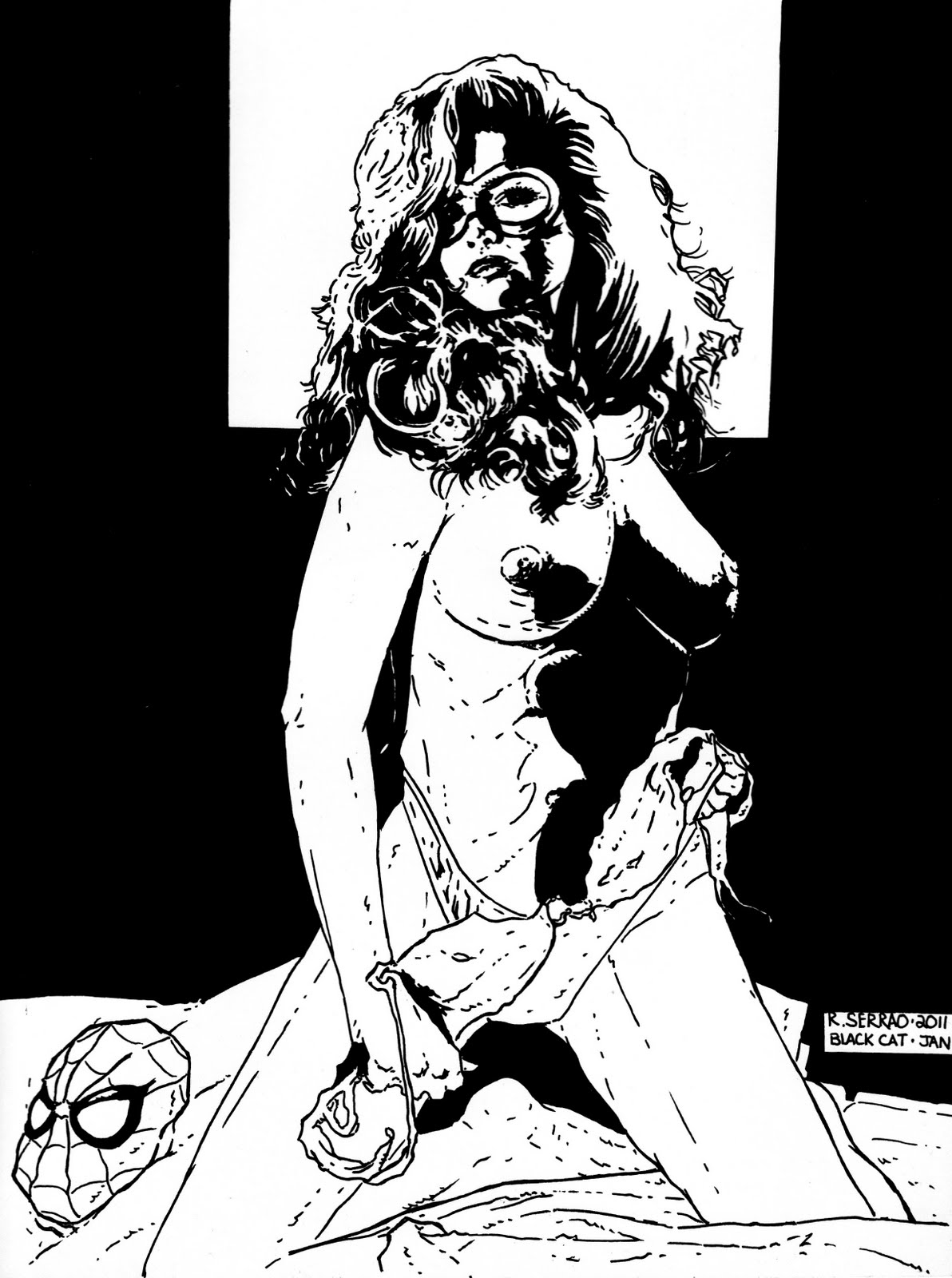
Step by step process of my Black Cat drawing from Black and white to colour.
Hi and welcome back. Todays Blog is a step by step process of how I colored an Image I drew and maybe give you a bit of insight and hopefully you might learn something new. When I originally decided to do a pin up of an established female character like the Black Cat I not only wanted to make her sexy but I also wanted to have a bit of fun at the same time. It took a lot for me to add colour to my black and white original image. When you start colouring your original there is always the chance that you might make a mistake and ruin it, so you have to be very careful how you approach the colouring process. I had decided to keep the colouring scheme very simple, mixing watercolurs, markers and coloured pencils. Some of the other tools I later used were a bit of an accident and that i'll get into a bit later on in the Blog. Watercolours came first. This was the base for the whole picture. I used the watercolurs dry and avoided getting my paper wet before I put the colours down on the art page. Some people like to colour their work when the page is wet first and that's just fine for them but I have a need for controling just how my work is coloured. If you get your page wet first there is always the chnace that the colours run and smear in a way that you didn't intend. So if you're a control freak like me then dry is definitely the way to go. I used the smallest tip brush I had. Why? Because this way I could really spread the paint and the lines of demarcation for each time my brush dried was minimal. Another little trick that i discovered helped give the artwork a seemless appearance. Because of the black background this made things a bit easier colour wise and also a lot faster. Once the watercolours had dried I could then go in with coloured pencils for some accents on the image. Initially the web in the background was done with a white coloured pencil but while it was subtle it didn't have the punch I was looking for, so I decide to try something a bit more drastic. I had just gotten some opaque white acid free pens and was itching to try them out. I ended up getting a bit too carried away when I was doing the web . Still I needed to add another layer to the picture as I still felt something was missing. I started splattering grey ink on the page, followed by white ink. Then finally adding in some white highlights in the Cat's hair and around her body to make her stand out a bit more against the web background. Her lips were the last thing I played around with. After some of the white lines had dried I went back in again and added even more accents. Some of the shadows I had done were a bit too dark and needed to be lightened and this way of doing it was more work than I would have liked but once again I could control every step of how much detail went into the final image. A lot of what ended up on the final page wasn't even planned and I just got carried away. In the end it turned out better than I even imagined. On the technical aspects of this Blog. I used 2 different size of brushes and neither of then were expensive. In fact all of the tools used to create this image were anything but expensive. The brushes were bought in bulk and came up to mere cents for each unit. The white opaque pen was about 3.00 US for a pack of 2 pens. My technical pens are made by Sakura and are disposable and a pack of 3 different sized nibs reatails for about 10.00 Canadian and last about 5-9 months and that depends on how rough you are and how often they are used as well. They are acid free and waterproof. Those 2 details are very important. Acid free means that the lines you put down on paper won't yellow with time like a sharpie would. Waterproof is also very important and when using watecolours it stops the lines from smearing. These pens dry very fast and are easy to manipulate when drawing. How much pressure you put down on the nibs are also another important issue that needs to be addressed. You almost have to look at the pens as incredibly fragile and vary exactly how much pressure you put down on them. This makes them last longer and it can also give your lines are lot more vary widths,especially when you are either cross hatching or doing some kind of feathering effects in your artwork. I tried dragging my brushes across the page keeping part of my hand on the page at all times. This helped me not over emphasize any areas that I was colouring. This comes back down to how much pressure is put down on the paper and exactly how the paint applies to the artwork. I tried to be as subtle as possible. Working on a woman subject is difficult because if you put too much detail in the face you can age the subject and that can also ruin the effect of beauty and allure that you're trying to achieve. Now that doesn't mean that older women aren't beautiful but close attention has to be payed to the age of the subject/character that is being painted or drawn. To do the splattering effect on the artwork I used an old toothbrush, white and black ink. This was incredibly easy to do the grey and white splatters by mixing the 2 inks together in equal parts and then dipping the toothbrush into it and then splattering it onto the artwork. Now this is a very tricky thing that you're doing so if you want to control the way the ink splatters and where it splatters, you have to give it direction and at the same time protect the image you just drawn. It was a simple task. I just took some copier paper and cut a hole in it a bit smaller than that of a tennis ball. This way I could do sections of the artwork and then redo them if nescessary. All the while keeping a close eye on how much white and grey ink went onto the page. The splatter effect also requires a bit of practice but it is quite an easy technique to master. The brush acid free markers I used for tiny details are also made by Sakura and the colours are very nice and bright and are perfect for tiny highlights. Copic markers are awesome but very,very expensive. The pack I initially bought only cost me 5.00 US and I expanded the amount I had by adding different types to my collection. The type of coloured pencils I used were made by Prismacolour and I've had these pencils for the better part of 18 years and they are surprisingly long lasting and very durable. Originally when I bought these pencils I had paid only 50% of the regular price and I got a complete set of over 144 colours. To this day I still have them. They were a great buy. I hope this Blog has given you ideas of techniques that you might like to try for your own work as well as some tools that you can play with for your upcoming works of artwork. Rich.

 . Still I needed to add another layer to the picture as I still felt something was missing. I started splattering grey ink on the page, followed by white ink. Then finally adding in some white highlights in the Cat's hair and around her body to make her stand out a bit more against the web background. Her lips were the last thing I played around with. After some of the white lines had dried I went back in again and added even more accents. Some of the shadows I had done were a bit too dark and needed to be lightened and this way of doing it was more work than I would have liked but once again I could control every step of how much detail went into the final image. A lot of what ended up on the final page wasn't even planned and I just got carried away. In the end it turned out better than I even imagined. On the technical aspects of this Blog. I used 2 different size of brushes and neither of then were expensive. In fact all of the tools used to create this image were anything but expensive. The brushes were bought in bulk and came up to mere cents for each unit. The white opaque pen was about 3.00 US for a pack of 2 pens. My technical pens are made by Sakura and are disposable and a pack of 3 different sized nibs reatails for about 10.00 Canadian and last about 5-9 months and that depends on how rough you are and how often they are used as well. They are acid free and waterproof. Those 2 details are very important. Acid free means that the lines you put down on paper won't yellow with time like a sharpie would. Waterproof is also very important and when using watecolours it stops the lines from smearing. These pens dry very fast and are easy to manipulate when drawing. How much pressure you put down on the nibs are also another important issue that needs to be addressed. You almost have to look at the pens as incredibly fragile and vary exactly how much pressure you put down on them. This makes them last longer and it can also give your lines are lot more vary widths,especially when you are either cross hatching or doing some kind of feathering effects in your artwork. I tried dragging my brushes across the page keeping part of my hand on the page at all times. This helped me not over emphasize any areas that I was colouring. This comes back down to how much pressure is put down on the paper and exactly how the paint applies to the artwork. I tried to be as subtle as possible. Working on a woman subject is difficult because if you put too much detail in the face you can age the subject and that can also ruin the effect of beauty and allure that you're trying to achieve. Now that doesn't mean that older women aren't beautiful but close attention has to be payed to the age of the subject/character that is being painted or drawn. To do the splattering effect on the artwork I used an old toothbrush, white and black ink. This was incredibly easy to do the grey and white splatters by mixing the 2 inks together in equal parts and then dipping the toothbrush into it and then splattering it onto the artwork. Now this is a very tricky thing that you're doing so if you want to control the way the ink splatters and where it splatters, you have to give it direction and at the same time protect the image you just drawn. It was a simple task. I just took some copier paper and cut a hole in it a bit smaller than that of a tennis ball. This way I could do sections of the artwork and then redo them if nescessary. All the while keeping a close eye on how much white and grey ink went onto the page. The splatter effect also requires a bit of practice but it is quite an easy technique to master. The brush acid free markers I used for tiny details are also made by Sakura and the colours are very nice and bright and are perfect for tiny highlights. Copic markers are awesome but very,very expensive. The pack I initially bought only cost me 5.00 US and I expanded the amount I had by adding different types to my collection. The type of coloured pencils I used were made by Prismacolour and I've had these pencils for the better part of 18 years and they are surprisingly long lasting and very durable. Originally when I bought these pencils I had paid only 50% of the regular price and I got a complete set of over 144 colours. To this day I still have them. They were a great buy. I hope this Blog has given you ideas of techniques that you might like to try for your own work as well as some tools that you can play with for your upcoming works of artwork. Rich.
Tuesday, March 15, 2011

Okay, this Blog will follow the previous two others as everything written in them happened in the span of one day. The point of talking about and showing my successes and failures of that particular day is to show that despite how the day started with a less than ideal piece of artwork, I didn't give up but continued to push my limits of patience,concentration and skill. The Black Cat drawing gave me just enough of a boost that I decided to do a quickie Baroness pinup. Keep it simple and don't put too many lines on the page and see what happens.
For drawing women,less is the ideal way to go. Granted this version of The Baroness is slightly different than the one most people are accustomed to seeing but I still think doing this drawing was well worth the effort. If I try a type of artwork that I've never attempted before the most important thing is to learn from the experience. It doesn't hurt either if the artwork exceeds your expectation either.
The Baroness piece took about an hour and fifteen minutes, a new personal best for me. The tools I used were Sakura 01,03,05 and 1 Calligraphy pens, they are acid free, dry very fast and are very easy to work with. They are also very cheap to buy,last a long time and are disposable. I also used a B5 Speedball nib to fill in any large black areas. Speedball Super Black India Ink is my favorite Ink out there right now. I mix this type of ink with a cheap chinese no name brand of India Ink and this has worked great for me over the past few years. I know some artists might think this is sacrilege mixing two different inks together but I just follow my instincts when it comes to drawing. So far they have never been wrong.
This was a great day of creating for me, despite being heavily drugged with painkillers and anti-immflamatory pills. I also tried very hard to allow myself a certain amount of creative freedom and not forcing any one subject over the other but just going with whatever I felt like drawing at the time.
Rich.
Wednesday, March 2, 2011
Experiments part 2

Okay, so continuing directly from the last Blog.
Once I had finished the coloring of Indiana Jones and saw that I hadn't completely lost my feel for using watercolors, I took a small break and had a quick bite to eat, let the colors dry and try and see how the final image would look.
Once I finished eating and saw the final image, I continued drawing and took a longshot and drew a female character. Drawing women can be very tricky, too much detail and you age the woman, not enough can also have a negative effect. To a lot of people Adam Hughes is one of the best at drawing the female form so I grabbed a few covers that he did and tried to get a feel for what he was doing. After about 30 minutes of brushing up on cheesecake pinups I grabbed a Playboy too. I figured it couldn't hurt. I wanted to draw Black Cat from the Spiderman comics and wanted to make her as sexy as possible, maybe derobe her a bit. Make her sexy but not too over the top and make her crass. What I ended up with was more or less some cheesecake pinup work with a slight edge but the background seemed a bit bare...
Taking a few minute to let the ink dry, I walked away to drink some water and wash my face. Checked my e-mails for a few minutes and then came back and took another look at what I had done. I think I did a decent job but something was still missing. I put the image aside and went to work on another, working on the template for a Baroness image, which I'll show the completed image another time.
Now it's a few weeks later and I'm glad I stopped working on the Black Cat image because now I can go back and add in some color with a few adjustments to the background and overall image and yes I'm doing it on the original and not in Photoshop. Once I've completed the final image with the colors and reworked background I'll be showing it. Following my hunches I don't think this will be a failed experiment but the final image will be something completely new for me. Trying new things is good for your growth as an artist.
Rich.
Tuesday, February 22, 2011
Painted artwork 22 feb

Hi and thanks for checking out my stuff.
These days it seems that as much as I try to do less seems to get done. That's probably because I was doing an insane amount of work before and needed a LOT of time to try and recharge my batteries, so to speak. As much as we'd like to think that we're unbreakable, this is far from true. I'll get back to this in a minute and what this has to do with me starting back to play around with painting my artwork again after such a long time away from color work. At some point I was just pushing myself too hard and I got a rude wake up call a few weeks ago, I hurt my back and it's been a while that I felt pain quite that intense. So after a trip to the clinic, some time off prescribed by the Doctor and two different types of medications, I was off for my first week.
I'm really not sure if it was the meds or a longing to see my work colored the way I wanted it. Here's the thing, as much as I love working with other colorists, it's a bittersweet collaboration. I'm way too much of a control freak, so either I learn how to color my own work the way I want or content myself with having to burst some poor guy's bubble on his coloring efforts. Which by the way is not something I enjoy doing. Ever. Maybe it was the heavy duty buzz I had during this period that made me willing to explore slinging some paint onto my black and white originals.
For the most part, it was an enjoyable time and as you can see this was my first attempt after several years.
I learned something very important about layering and colors. Overall coloring time was less than an hour. I tried to stay loose, unstressed and see what happened. To any artist this is ideal but the reality is that for most other artist types to get into this zone it happens without our control, which can be a very frustrating thing and that's pretty much what happened to me during the time I was painting this image. Another positive was blending the colors, it was a lot easier than I remembered and that part of this little experiment went off perfectly. I was using incredibly small tipped brushes that I bought cheaply in bulk. I like trying out different types of tools and I'm a firm believer that it's the artist that's the important factor and the tools are secondary. Please remember that this is just an opinion I developed from looking at a few artists that used whatever was at hand and still ended up with awesome looking images. I kept the color scheme based on varying shades of earth colors. That part worked but then I got the bright idea to make the background a shade of rose, not sure why. This is the point where I should have stopped and taken a step back and looked and what I had done. I lost patience and just wanted it done. That was the problem right there. I lost my concentration and just phoned in the background.
I think the fact that once I was done I didn't freak out and quit work for that particular day. I started back drawing another image which I will show at another time but the most important thing I want to talk about is not giving up despite being unhappy with the final result. The next drawing I would do turned out quite amazing And I still went back and painted another image and that too is for another time. For now let's just look at the painted watercolor version that I ended up with. Any comments are greatly appreciated. It's Indiana Jones by the way.
I will be showing a lot more failures as well as those I consider a success.
More to come soon.
Rich.
Subscribe to:
Posts (Atom)